Thursday, November 28, 2013

It's rust removal, Jim

...but not as we know it.

You know how I said I absolutely wasn't going to get into old pens in a car-boot-sale-scouring way? Well, a lucky break in an antique shop doesn't count, does it?


A black Parker England Duofold Junior with, astoundingly, a soft-ish fine nib and aerometric filler! It may be love. Bit scratched up, but apparently that's their fate. Am hopelessly confused by the Parker timeline (Think of when you first tried to type a Stanley bench plane. Yeah, that bad) but I think it may be from the 60s. Possibly. A later one, anyway.

I think I also said I wasn't going to buy any Parkers, didn't I? Well if you're going to break a resolution, I always say you might as well go big and do the job properly. Another English one with aerometric filler; this time a Victory with a less lovely medium nib. I may grow to like it, you never know. If not, the box may help it find a new owner. This one has a Parker date code, which is supposed to be helpful. Not to me it ain't. But someone did write "25-1-55" on the box, which seems to fit as a likely date of purchase as far as I can tell.


Now that Conway Stewart box. Yeah, about that... Here's the actual Conway Stewart bit in it; a "Nippy" pencil (with five spare leads - handy). I'm not a big posh pencil person, but it's kinda nice, isn't it? I could easily take it as a sign that I need to find a matching pen. Any excuse.

Conway Stewart still makes pens - or rather a new company uses the name and makes pens. They're not cheap, and they're in Devon, so that's two good reasons why I shall likely never own a modern one. ;)

And finally the mystery pen. Utterly unmarked blue and brown marbled button filler. Judging by the rather poor quality bent metal clip (loose) and the three-rings-in-one-piece cap band (also loose), this pen may well aspire to be by a third tier maker. Funky colour scheme, no? Wouldn't have chosen it myself, but it grows on you. Like mould.

Poor thing had suffered in a water attack on that Conway Stewart box (you may have noticed the staining) and lost a good deal of its wafer-thin plating to the resulting oxidisation. Once again I indulged in the heady excitement of crusty rust removal and, I suspect, as a result may be hooked by pen restoration. Dammit. What is it about taking the unloved and unusable implement and making it work again? I just love it. 

Anyway, "Button filler"; meaning you unscrew the end cap and press the little button which pushes on the bar that flexes another bar out to push against the ink sac to squeeze it closed so when you put it in the ink and let go of the button the ink is drawn in. (Clear as mud? How about a demonstration using a cutaway pen here on YouTube.) Except, funnily enough, ingenious though this system is, it doesn't work so well when your ink sac looks like this.

*Shudder*. So I see a steep and exciting learning curve of button removal and sac replacement in my near future. Another one, because I've already tripped the light fantastic on the bent-nib-straightening curve when I cleaned the crusted on ink off the nib of this thing and found unhappiness. But I managed that hurdle okay, and a dip test shows it to be a rather nice medium - I think- stub with a bit of give to it. Very pleasant to write with, so worth getting it working again.

Incidentally, guess what I'll need to stick a new sac on with, kids? Shellac. Hmm, now do I have any of that around here, I wonder...

My initial impressions notes and scribblings while dip testing the three pens

Monday, November 25, 2013

Monday Stinks #3

I would like to think I'm getting better at capturing the full majesty (or not) or some of these colours - but it seems not. The Ancient Copper has not fared well, which is a shame. Anyway, here we go.


I don't think the Umber will stay in the Serwex for long; it's proving to be a little too dry to keep up with the improved flex. Huh, just think, short months ago I'd be going "What the heck do you mean, dry ink?!"

I seem to be in my orange pen phase, here; shocking pink and orange is not a good combination. The orange behemoth, incidentally, was a car boot purchase. Yup, I'm already slipping. It's truly hideous and pretty badly designed, but the ink flows from it in just the right amount, and it's surprisingly smooth. Better than the Waterman, actually.

Thursday, November 21, 2013

Small plane, big ticket

Ah, planes, tickets. You going on a long journey, Alf? I hear you wonder. Don't be daft. No, I mean planes. Proper planes. With soles and blades and handles I can complain about.

Belatedly I've remembered that this year's miniature tool from the Lee Valley elves should be about the place, so I went to have a look.


Ooo, it's an ickle spokeshave. Schweet. Darn it, and here's me with a fountain pen-sized hole in my finances where a miniature spokeshave should be. Oh well, my own fault for failing to plan ahead; will have to start saving.

And, you know, I can't help wondering if those handles are customisable...

Financially speaking, it could be a lot worse. I could want one of these:


8mm high (that's, what, 5/16"?) and 14k gold. Well, gold is expensive at the moment, but still - £190.06 (plus delivery!) One hundred and ninety Earth pounds?! (And sixpence). I goggled a bit, I must admit. It's not even than attractive really, is it? I mean it doesn't even appear to have that rounded bit behind the blade to make for a more comfortable pushing experience. Tsk. And the edge holding properties of 14k gold are, I suspect, poor.

Still, if you've just got to have a continental-style hand plane rendered minutely in gold hanging round your (or your best-beloved's) neck, then there you go. Your needs are met. No, don't thank me...

Monday, November 18, 2013

Monday Stinks #2


Technically Sunday Stinks, because I'm writing this on Sunday evening (and that's why the lighting is appalling). Oh, and the paper is Q Connect bank paper; small notebook and I ran out of room. Let us not dwell on what style of handwriting I was trying to employ; I clearly failed.

The Kakuno, incidentally, appears to be of the same nib family as the MR/Metropolitan/Penmanship/Plumix/Prera/78G - Pilot's popular group of nib-swapping pens. So in theory you could have a perfectly respectable-looking MR or Prera, quietly sporting a smiley-faced nib under the cap. Which, as someone who's stuck goggly eyes on a hand plane, appeals to me beyond all reason.

(By-the-by, it belatedly occurred to me that not everyone is familiar with their basic Cockney rhyming slang so just in case: Pen and Ink = Stink. See what I did there? Impressed? No, didn't think so...)

Friday, November 15, 2013

Zen and the Art of Graphscribeology

Amongst the comments here, JW asked an interesting thing concerning the effort to improve my handwriting. Viz:

      "Do you find yourself slowing down and thinking more clearly, even just to match pace with your hands? What other effects has it had on you?"

Well, I'd like to say I'm now a more considered writer, thinking through what I'm writing before I commit it to paper. But, um, not yet. Truth is I'm still very much a schizophrenic graph- scribe-, um, handwriter; there's the writing style you get when I'm writing, and then there's the, ha-hum, "style" you get when I'm actually writing. For instance:


On the left is the "nice" writing; I feel like I'm actually making some progress with that now. Tweaking a few things to suit me better, notably some of the upper case, but on the whole it makes a pleasant page to my eye (even in that colour). And I think it's legible.

On the right is the second page of a first draft for this blog post (Whoops - spoilers!). The first page started out... better. But then you get into the flow of thoughts over the flow of your hand, and this ensues. A common problem. The goal is to reduce the gap between the two, and that means lots of practice with the "nice" writing.

Now that has had an unexpected benefit. The classic method to concentrate on how you're writing over what you're writing is, naturally enough, to write out someone else's words. Back in school we were set to copying out recipes, it being an all-girls' school with a curriculum that probably dated from the 1920s... With my own choice of text before me, I started out with poetry; but once I was word-perfect on The Jabberwocky, I felt in (urgent) need of prose. At the moment I'm scribing my way through Good Omens, which should keep me in unusual names and sufficiently amusing jokes to stave off boredom for a while.


I'm trying to spend forty-five minutes to an hour in the evening just writing it out, and I'm finding it's really rather relaxing. The cats and parrots are all abed, the household in general is pretty peaceful and dozing over the crossword, so I don't even need to plug myself into some headphones to be able to focus and get "in the zone". It's rather like sketching or doing watercolours, without needing any grasp of perspective; the formation of the letters becomes the only important thing. And the extra benefit? It's way better than a mug of Horlicks for winding down to go to sleep. Honestly, it is. Perhaps that's just me, but I find it terribly helpful in getting my brain to switch off and stop churning over this 'n' that as it is otherwise wont to do.

So, I'm slowly stacking up the Séyès ruled cahiers with all this practicing, and really by now the gap between legibility and composition ought to be smaller. Except I complicate things. Potential graphscribeologists, learn from my schoolgirl errors:

1. Settle on one pen. Do not introduce fifteen different pens into your arsenal, especially ones that are, by their nature, designed to make you write completely differently. F'rinstance, if you're not learning an italic hand, do not dig out your italic nib:


1(b). Also, do not get side-tracked by different inks, paper, filling systems, etc...

2. Stick with one style of handwriting (see above). Do not randomly make it start sloping backwards and think "Ooo, that's curlier. I might work on that." It Does Not Help.

(Ceased? Seized, dammit. Oh well, it was late...)

2.(b) Do not get side-tracked by how your handwriting is effected by different inks, paper, filling systems, nibs, or wondering if it's possible to have a pen from every pen-making country in the world and still be solvent (Did you know the Turks make fountain pens...?)

3. Basically, don't do it my way.

4. And Pelikan 4001 Violet is pink, whatever anyone says.

May the force be with you your nibs flow sufficiently damply and you ascenders and descenders remain at more or less the same angle throughout.

Wednesday, November 13, 2013

Putting the Cr and Feh into Art

Another bout of tidying suddenly came upon me.  Not for long, thankfully, but long enough to happen across a postcard from an good friend sadly no longer with us. As ever, she'd found an apposite and interesting postcard to send; an Italian cabinet in the V&A.


All the info on it is here on the V&A's page. You've gotta love the 50s, despite the bum rap they so often get; there was a lot of innovation that went on. Yes, a piece of hand-cut marquetry on a cabinet would be my first choice if the option was offered, but this is actually pretty cool, isn't it? Really worth hitting the link to see it with the doors open too.

Can't help but notice the actual maker gets third billing on the info page. So it goes. But at least there's a mention at all. I may have already told you this story, but by curious by-ways I've ended up hearing tales from a workshop that is employed, amongst other things, by artists to realise their artistic vision. Thoughtfully these incredibly skilled welders and joiners often get invited to the previews of said artist's exhibitions - on strict condition that they don't reveal that they were the ones who actually made the stuff...

Apparently they don't mind, as long as the drinks and nibbles are up to standard. ;)

Monday, November 11, 2013

Monday Stinks

This is mainly for my benefit; rather like listing tools used. If I keep a record of what pen and inks I'm using every week so often, I can see what keeps cropping up, and whatever vanishes from sight can be disposed of.

See? I'm totally going to stay on top of this thing from the start.

Yes, I am.

Should a flicker of interest flare briefly in anyone and they want further illumination of any aspect, speak up.

Thursday, November 07, 2013

Have notebook; unlikely to travel

Apparently they reckon four million tablet computers are going to be sold in the UK between now and Christmas. Four million. My mind, she boggled. But then I'd failed to take into account that, apparently, many of them will be for the kiddies. Sheesh. When I was an infant I could whine for the latest trendy gadget 'til I was blue in the face and I'd end up with... a blue face.

Mind you, the latest trendy gadget at the time was a Filofax, and the lack of business contacts to keep track of and international conferences I was attending age ten-ish does, in hindsight, seem a reasonable argument by my parents. Undeterred though, I naturally turned to the DIY option instead. A cannibalised ring binder, some cardboard, and lots and lots of sticky tape later and I had... a not very good DIY Filofax. But it got the thing out of my system at zero cost (apart from the ring binder), I learnt that sticky tape is not the answer to everything, and generally it was a Good Thing, so that was all right.

Probably a bit much to ask the tablet-seeking youth to DIY themselves a printed circuit board and so forth, unfortunately. Perhaps the modern equivalent would be a Raspberry Pi?

Anyway, moving on some *tumpty-tumpty* years, recently I seem to be reliving those glory days of desiring the Trendy Thing, having the financial Powers That Be say "Nope" (The voice of conscience in this case), and turning once more to the DIY option.

The Trendy Thing is the Midori Traveller's Notebook, which is essentially a Filofax but with more elastic. Like the Filofax (and many another Trendy Thing), it promises much; your horizons will be remorselessly broadened and you will likely become a world traveller to rival Alan Whicker just by buying this notebook. Much like the beguiling idea that you'll become really organised by buying a Filofax. Well, no, you won't. But how appealing that it might possibly be so.

What's not appealing is the price, and particularly the cost of the (oddly-sized, and thus next to impossible to get from anyone else) "inserts". Or "notebooks" as the less broadly-horizoned stay-at-home such as myself might call them. So very like a Filofax then.

But it had hooked me despite my better judgement and the Wisdom of Age (yeah, right), and these days with the effects of the aluminium pans kicking in, I really need to make notes of things then and there or they will be utterly lost to me. Plus I find I need a diary; having to keep track of the folks' appointments for this'n'that really wasn't working on my iPod's calendar, because they won't believe it's true unless it's written down on paper...

Anyway, many excuses justifications later I went forth to a) DIY it, and b) Make it a more useful size, and c) Find lots of other people had got their first and the web is littered with instruction on making your own, and inserts to go with it. Huzzah!


I went with the info at My Life in One Place; there is much there, and a video somewhere that I can't currently find going through it all step by step. A general Google search will find lots of info, videos and etc. The 90mm x 140mm notebook size means it'll take notebooks by all sorts of manufacturers (Rhodia, Clairefontaine, Calepino, as well as Field Notes and the over-hyped but readily available Moleskine), but actually I ended up making my own notebooks as well.


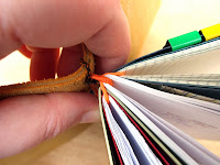
Idiot that I am; shoulda put the knot on the outside. It's a learning process. Also had mediocre success with printing out a diary - it works, but the size won't come out quite right. But hey, wide margins for notes are a feature, right?

The cover itself is rescued from a chisel roll that I have always hated. I pretty much still hate it - the split leather effect is not great, and the colour is... well, yeah - so now I've ascertained this system does seem to work for me, I'm considering actually purchasing some leather that I like to make a replacement (*swiftly gags the voice of conscience before it points out the likelihood of spending more on the DIY version than it'd cost to buy the real thing*). Elastic is 2mm round, widely sold to the beading fraternity. 1.5mm seems to be okay too, but 1mm I found a little too thin.


For this pocket sized version, hair bands - yes, hair bands - make excellent extra elastics for joining notebooks together, and have a neat joining metal crimpy thing, thus eliminating a need for knots. Something other than neon orange would probably be preferable, but that's all I could find at the time...


Still very much a work in progress (it's already changed from these pictures), and some improvements needed. Not wildly happy with the current pen holder, f'rinstance - and not just because it's ugly as hell...


Anyway, all good fun and useful. Oh, and an excuse for some tool use; aside from a leather punch, an in-canel gouge makes a neat job of rounding the corners, and an awl unexpectedly found itself plucked from obscurity and re-designated as a bookbinder's tool. 

Bookbinding; now there's a whole other slippery slope... No. Nope. Not going there.

Friday, November 01, 2013

Fountain Pen Day Epistle


Text version:
Behold! 'Tis Fountain Pen Day!

For it is written that today ye shall go forth (or fifth) and Fount in a Pen-like manner.

I had planned to engage your interest with cunning employment of a WOODEN pen, but alas, the only one available to me is this example in the Old Man's possession and it is rather too short and tapering to be comfortable to use.

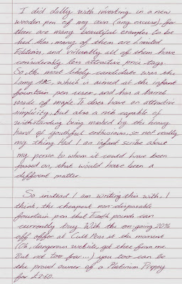
I did dally with investing in a new wooden pen of my own (any excuse), for there are many beautiful examples to be had. Alas, many of them are Limited Editions, and virtually all of them have considerably less attractive price tags. So the most likely candidate was the Lamy ABC, which is aimed at the infant fountain pen user, and has a barrel made of maple. It does have an attractive simplicity, but also a nib capable of withstanding being mashed by the heavy hand of youthful enthusiasm, so not really my thing. Had I an infancy scribe about my person to whom it could have been passed on, that would have been a different matter.

So instead I am writing this with, I think, the cheapest non-disposable fountain pen that Earth pounds can currently buy. With the on-going 20% off offer at Cult Pens at the moment (Oh, dangerous website, get thee from me. But not too far…) you too can be the proud owner of a Platinum Preppy for £2.60.

You get a cartridge with it, so it's ready to go (The purple is vile, btw. And the blue is more a blue-black, so okay for business use) And it's really not half bad.

Plus it has scope for adjustment; this one has been converted to an "eye dropper" filling system, and I've been using them as guinea pigs for nib grinding, This one is now a little finer and with a hint of italic.

Now you can't do THAT with a ballpoint.

Happy Fountain Pen Day! 

Paper: Nu: elite B5 notebook
Ink: Diamine Syrah.

N.B. This is what my writing looks like when I'm not being precious about it (and when my back's killing me); it's a lot better than it was, but I suspect apologies are still in order...